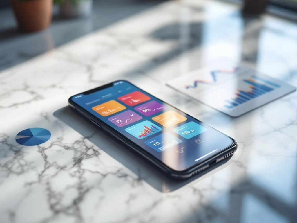
App store screenshots directly influence conversion rates because they serve as your app’s visual sales pitch. Users spend just seconds evaluating your app, and screenshots often determine whether they download or move on. High-quality screenshots that clearly showcase key features and benefits can significantly improve your conversion rates and drive more downloads.
What makes app store screenshots so important for conversions?
Screenshots function as your app’s primary visual communication tool in both the App Store and Google Play. When users browse app stores, they make split-second decisions about whether your app meets their needs, and screenshots provide the visual evidence they need to decide.
These images serve multiple purposes in the user decision-making process. They demonstrate your app’s interface quality, highlight key features, and communicate the value proposition without requiring users to read lengthy descriptions. Screenshots also build trust by showing exactly what users will experience after downloading.
The visual nature of mobile browsing makes screenshots particularly powerful. Users often scroll through app listings quickly, and compelling screenshots can stop them mid-scroll. High-quality screenshots that clearly communicate your app’s benefits often become the determining factor between a download and a missed opportunity.
How do users actually look at screenshots in app stores?
Users typically spend 3–5 seconds scanning app store listings before making decisions. They view screenshots in a predictable pattern, starting with the first image and often only looking at 2–3 screenshots before deciding. This brief attention span makes your visual presentation absolutely critical.
Eye-tracking studies reveal that users focus on specific elements within screenshots. They look for familiar interface patterns, scan for text overlays that explain features, and assess visual quality as an indicator of app reliability. Users also compare screenshots mentally to other apps they’ve used or considered.
Mobile browsing behavior adds another layer of complexity. Users often browse app stores while distracted or multitasking, which means your screenshots need to communicate value instantly. Visual hierarchy becomes crucial because users need to understand your app’s purpose and benefits within seconds of seeing your screenshots.
What elements make screenshots convert better than others?
High-converting screenshots combine clear visual design with strategic content placement. The most effective images show actual app interfaces with minimal clutter, allowing users to envision themselves using your app. Clean, professional design suggests a high-quality app experience.
Text overlays work well when they highlight specific benefits or features that aren’t immediately obvious from the interface alone. However, the text should be large enough to read on mobile devices and shouldn’t overwhelm the visual elements. Feature highlighting through callouts or annotations can draw attention to unique functionality.
Composition principles matter significantly for conversion rates. Screenshots should follow a logical visual flow that guides the eye through important elements. Using consistent color schemes and maintaining visual coherence across all screenshots creates a professional appearance that builds user confidence in your app’s quality.
How many screenshots should you use and in what order?
Most app stores allow 5–10 screenshots, and you should use this full allocation to tell a complete story about your app. The optimal approach involves creating a sequence that addresses different user motivations and concerns throughout their evaluation process.
Your screenshot sequence should start with your strongest visual that immediately communicates your app’s main purpose. The second screenshot typically works best when it highlights your most compelling feature or benefit. Subsequent images can showcase additional functionality, demonstrate ease of use, or address common user concerns.
Consider your user journey when ordering screenshots. New users need to understand what your app does, while users further along in the consideration process want to see specific features or functionality. Strategic sequencing ensures that users get the information they need regardless of how many screenshots they view before making their decision.
What common screenshot mistakes hurt app store performance?
Poor visual quality represents the most damaging mistake you can make with app store screenshots. Blurry images, inconsistent design, or outdated interface captures immediately signal low app quality to potential users. These visual problems create doubt about your app’s reliability and professionalism.
Confusing messaging through cluttered text overlays or unclear feature explanations also reduces conversion rates. When users can’t quickly understand what your app does or why they should care, they move on to alternatives. Overloading screenshots with too much information creates cognitive burden rather than clarity.
Many apps also make sequencing errors by burying their most compelling features in later screenshots. Since most users only view the initial images, placing weak or generic screenshots early in your sequence wastes valuable conversion opportunities. Feature overload in individual screenshots can also overwhelm users rather than persuading them.
How do you measure and improve screenshot effectiveness?
App store optimization platforms provide conversion rate data that show how your screenshots perform compared to industry benchmarks. You can track metrics like impression-to-install conversion rates and monitor how changes to your screenshots affect overall download performance.
A/B testing different screenshot variations helps identify which visual approaches work best for your specific audience. Test individual elements like text overlays, color schemes, or feature highlights rather than completely different screenshot sets. This approach provides clearer insights into what drives conversions for your app.
Regular performance monitoring allows you to identify trends and opportunities for improvement. App Store Optimization involves continuously refining your visual presentation based on performance data. We recommend reviewing screenshot performance monthly and testing new variations quarterly to maintain competitive conversion rates in your app category.
Frequently Asked Questions
How often should I update my app store screenshots?
Update your screenshots whenever you release major UI changes, add significant new features, or notice declining conversion rates. At minimum, review and refresh your screenshots every 6-12 months to ensure they accurately represent your current app and maintain visual appeal against evolving design trends.
Should I include real user content or use mock data in my screenshots?
Use realistic mock data that showcases your app's best features while avoiding real user information for privacy reasons. Create sample content that demonstrates typical use cases and highlights your app's value proposition. Avoid placeholder text like 'Lorem ipsum' as it appears unprofessional and doesn't help users understand functionality.
What's the best way to handle screenshots for apps with different user types or use cases?
Focus your primary screenshots on your largest user segment or most compelling use case, then use later screenshots to address secondary audiences. Consider creating separate screenshot sets for different app store categories if your app serves distinctly different user needs, but maintain consistent visual branding throughout.
How do I create effective screenshots if my app has a complex or technical interface?
Simplify complex interfaces by highlighting one key feature per screenshot and using text overlays to explain functionality clearly. Consider showing before/after states or step-by-step processes rather than static complex screens. Focus on the outcomes and benefits users achieve rather than the technical complexity of the interface.
What tools and resources do I need to create professional-quality app store screenshots?
Use design tools like Figma, Sketch, or Canva for creating polished layouts and text overlays. Screenshot framing tools like AppLaunchpad or Screenshot Builder can help create device mockups. Ensure you capture screenshots at the highest resolution your device supports and maintain consistent dimensions across all images for a professional appearance.
How do screenshot requirements differ between iOS App Store and Google Play Store?
Both platforms support 5-10 screenshots, but iOS requires specific dimensions (like 6.7" and 5.5" iPhone sizes) while Google Play is more flexible with aspect ratios. iOS tends to favor cleaner, minimalist designs while Google Play users often respond well to more detailed feature explanations. Test performance on both platforms as user behavior can vary significantly.
What should I do if my app's main value isn't visually obvious from the interface?
Use text overlays strategically to communicate hidden benefits, show result screens that demonstrate value, or create conceptual illustrations that explain your app's impact. Consider including testimonials, statistics, or before/after comparisons as overlay text. Focus on outcomes users achieve rather than the process of achieving them.