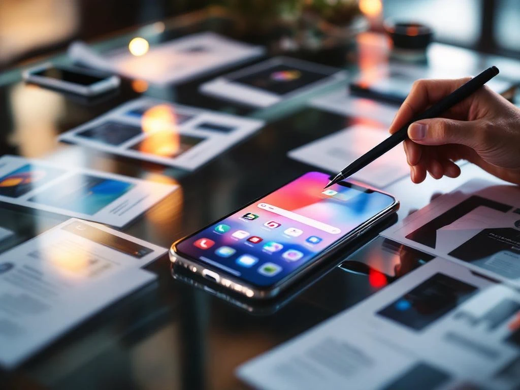
App store creatives are the visual elements that showcase your app in app stores, including screenshots, preview videos, icons, and feature graphics. They serve as your app’s first impression, directly influencing whether users download your app or scroll past it. These visuals work together to communicate your app’s value proposition and functionality at a glance.
What exactly are app store creatives and why do they matter?
App store creatives are the visual assets that represent your app in the App Store and Google Play Store. These include screenshots, app preview videos, icons, and feature graphics that appear on your app’s store listing page.
These visuals matter because they’re often the deciding factor in download decisions. When users browse app stores, they scan visually before reading descriptions. Your creatives need to quickly communicate what your app does, how it looks, and why someone should download it.
App store creatives function as your silent sales team. They work 24/7 to convert browsers into users by showcasing your app’s interface, highlighting key features, and demonstrating the user experience. Without compelling creatives, even the best apps struggle to attract downloads because users can’t visualize the value you’re offering.
The psychology is straightforward: people make quick judgments based on visual information. Your creatives either build confidence in your app’s quality and usefulness, or they create doubt that sends users to your competitors instead.
What types of app store creatives can you use to showcase your app?
You can use several creative formats to showcase your app effectively. Screenshots are your primary visual tool, with the App Store allowing up to 10 screenshots and Google Play supporting up to 8 screenshots per device type.
App preview videos add dynamic storytelling to your listing. iOS allows one preview video per localization, while Android supports multiple video assets. These videos should be 15–30 seconds long and demonstrate actual app usage rather than promotional content.
Your app icon serves as the face of your brand across the entire platform. It appears in search results, charts, and on user devices, making it one of your most important creative assets. The icon should be distinctive, scalable, and instantly recognizable.
Feature graphics are platform-specific opportunities. Google Play uses feature graphics as banner images, while iOS relies more heavily on screenshots and videos. Android also supports promotional graphics for special placements and seasonal campaigns.
Each platform has specific technical requirements for dimensions, file sizes, and formats. iOS requires specific pixel dimensions for different device types, while Android uses density-independent pixels that scale across various screen sizes.
How do app store creatives actually influence download decisions?
App store creatives influence downloads by triggering immediate emotional and logical responses in users. Visual elements create first impressions within milliseconds, determining whether users engage further with your listing or move on to other options.
Users scan app store listings in predictable patterns. They typically look at the icon, glance at screenshots, and may watch preview videos if initially interested. This visual assessment happens before they read your app description or check ratings.
The psychology behind visual decision-making involves pattern recognition and expectation setting. Users quickly assess whether your app looks professional, matches their needs, and appears easy to use. Poor-quality visuals suggest poor-quality apps, regardless of actual functionality.
Creatives also serve as proof points for your app’s capabilities. Screenshots showing actual features and interfaces build trust by demonstrating real value. Users want to see exactly what they’re downloading, not generic promotional imagery.
The conversion impact is significant because creatives influence both click-through rates from search results and conversion rates on your app store page. Better creatives mean more people visit your listing and more visitors actually download your app.
What makes app store creatives effective at converting browsers into users?
Effective app store creatives focus on demonstrating clear value and functionality rather than trying to look flashy or promotional. They show real app screens with actual content that users can expect to see after downloading.
Strong visual hierarchy guides users through your app’s story logically. Your screenshots should flow from key features to supporting functionality, creating a narrative that builds understanding and excitement progressively.
Effective creatives highlight specific benefits rather than generic features. Instead of showing empty screens, display your app solving real problems or enabling meaningful actions. Users need to visualize themselves using your app successfully.
Text overlays on screenshots should be minimal but impactful. Use brief, benefit-focused captions that explain what users are seeing and why it matters to them. Avoid cluttering visuals with excessive text that competes for attention.
Consistency across all creative elements reinforces your brand and builds trust. Your icon, screenshots, and videos should share visual themes, color schemes, and design approaches that create a cohesive brand experience.
Quality matters tremendously. High-resolution images, smooth video playback, and polished design elements signal app quality and developer professionalism. Poor-quality creatives suggest poor-quality apps.
How do you optimize app store creatives for better performance?
Creative optimization starts with systematic A/B testing of different visual approaches. Test one element at a time, whether that’s screenshot order, messaging, or visual style, to identify what resonates most with your target audience.
Track performance metrics that matter for your optimization goals. Monitor conversion rates from impressions to page visits, and from page visits to downloads. Also watch for changes in user quality metrics after creative updates.
Test different screenshot sequences to find the most compelling order. Your primary screenshot should immediately communicate your app’s main value proposition, while subsequent screens can dive deeper into specific features and benefits.
Experiment with different messaging approaches on screenshot overlays. Test benefit-focused copy against feature-focused copy, and try different levels of detail to see what drives more downloads from your specific audience.
Regular creative refreshes keep your listing feeling current and can improve performance over time. Update screenshots to reflect new features, seasonal campaigns, or improved user interfaces that better showcase your app’s evolution.
Integration with a broader App Store Optimization strategy amplifies creative performance. Your visuals should support your keyword strategy and complement your app description to create a cohesive, compelling store presence that drives sustainable organic growth.
Frequently Asked Questions
How often should I update my app store creatives?
Update your creatives every 3-6 months or whenever you release significant new features. Regular refreshes keep your listing current and can boost performance, but avoid changing everything at once as it makes it harder to track which updates are driving results. Focus on updating one or two elements per cycle while maintaining your overall visual brand consistency.
What's the biggest mistake developers make with their app store screenshots?
The most common mistake is showing empty or generic screens instead of real, populated content. Users want to see exactly how your app will look and function with actual data, not placeholder text or empty states. Always use realistic content that demonstrates your app's true value and capabilities.
Should I include text overlays on my screenshots, and if so, how much?
Yes, but keep text overlays minimal and benefit-focused. Use 3-7 words maximum per overlay to highlight key features or benefits without cluttering the visual. The text should explain what users are seeing and why it matters to them, not repeat obvious interface elements they can already see.
How do I know if my app store creatives are actually working?
Monitor your conversion rate from store page visits to downloads, which you can track through App Store Connect or Google Play Console. A good conversion rate varies by category but generally ranges from 15-30%. Also watch for changes in download volume and user quality metrics after creative updates to gauge overall impact.
What should be my first screenshot if I have multiple key features?
Your first screenshot should showcase your app's primary value proposition or most compelling feature that differentiates you from competitors. This is typically your core functionality or the main problem your app solves. Save secondary features for later screenshots once you've hooked users with your strongest value point.
Can I use the same creatives for both iOS and Android app stores?
While you can use similar creative concepts, you'll need different technical specifications for each platform due to varying dimension requirements. iOS and Android also have different user interface conventions, so consider adapting your screenshots to show platform-appropriate designs rather than using identical images across both stores.
How do I create effective app preview videos without a big budget?
Use screen recording software to capture actual app usage, then add simple transitions and brief text overlays highlighting key actions. Focus on showing real user flows rather than fancy animations. Keep videos 15-30 seconds, demonstrate 2-3 core features, and ensure the video loops smoothly for users who watch multiple times.
Related Articles
- What are the benefits of advertising your app on multiple platforms?
- How do you advertise an app and prevent ad fraud?
- How do you advertise an app while staying compliant with iOS privacy changes?
- 10 expert tips to advertise your app on a tight budget
- What metrics matter for app store optimization?
- How do you choose the right app store category?
- What is the difference between an app subtitle and short description?
- 8 best practices for app store keyword optimization
- What is keyword density in app store optimization?
- What are long-tail keywords in app store optimization?