Een goed app store-icoon combineert visuele helderheid, sterk contrast en een memorabele eenvoud om de aandacht te trekken in de drukke app store. De meest effectieve iconen gebruiken opvallende kleuren, vermijden tekst, blijven herkenbaar op kleine formaten en weerspiegelen het kerndoel van de app door middel van strakke designelementen. Je icoon is de eerste indruk die bepaalt of gebruikers erop klikken om meer over je app te weten te komen.
Wat zorgt er nu eigenlijk voor dat een app-icoon opvalt in de overvolle appwinkels?
Sterk visueel contrast en duidelijke focuspunten zorgen ervoor dat app-pictogrammen opvallen tussen duizenden concurrenten. Je pictogram moet binnen milliseconden de aandacht trekken terwijl gebruikers door zoekresultaten en categorielijsten scrollen. De meest effectieve pictogrammen maken gebruik van gedurfde kleurencombinaties die direct visueel onderscheidend zijn ten opzichte van omringende apps.
Visuele hiërarchie speelt een cruciale rol in de effectiviteit van iconen. Je wilt één dominant element dat als eerste de aandacht trekt, ondersteund door minimale secundaire details. Iconen die meerdere elementen tegelijkertijd proberen weer te geven, vallen vaak weg in de massa van appwinkels.
De psychologie van de eerste indruk heeft een grote invloed op het gedrag van gebruikers in appwinkels. Gebruikers nemen in een fractie van een seconde beslissingen over welke apps ze verder willen bekijken, puur gebaseerd op de visuele aantrekkingskracht. Je icoon moet kwaliteit en professionaliteit uitstralen en zich onderscheiden van de generieke ontwerpen die je in de meeste appcategorieën ziet.
Vorm en compositie beïnvloeden ook de opvallendheid. Ronde pictogrammen werken goed omdat ze een duidelijke afbakening creëren, terwijl geometrische vormen ervoor kunnen zorgen dat je app er georganiseerder en betrouwbaarder uitziet. Vermijd complexe illustraties die op miniatuurformaat onduidelijk worden.
Hoe eenvoudig moet je app-icoon eigenlijk zijn?
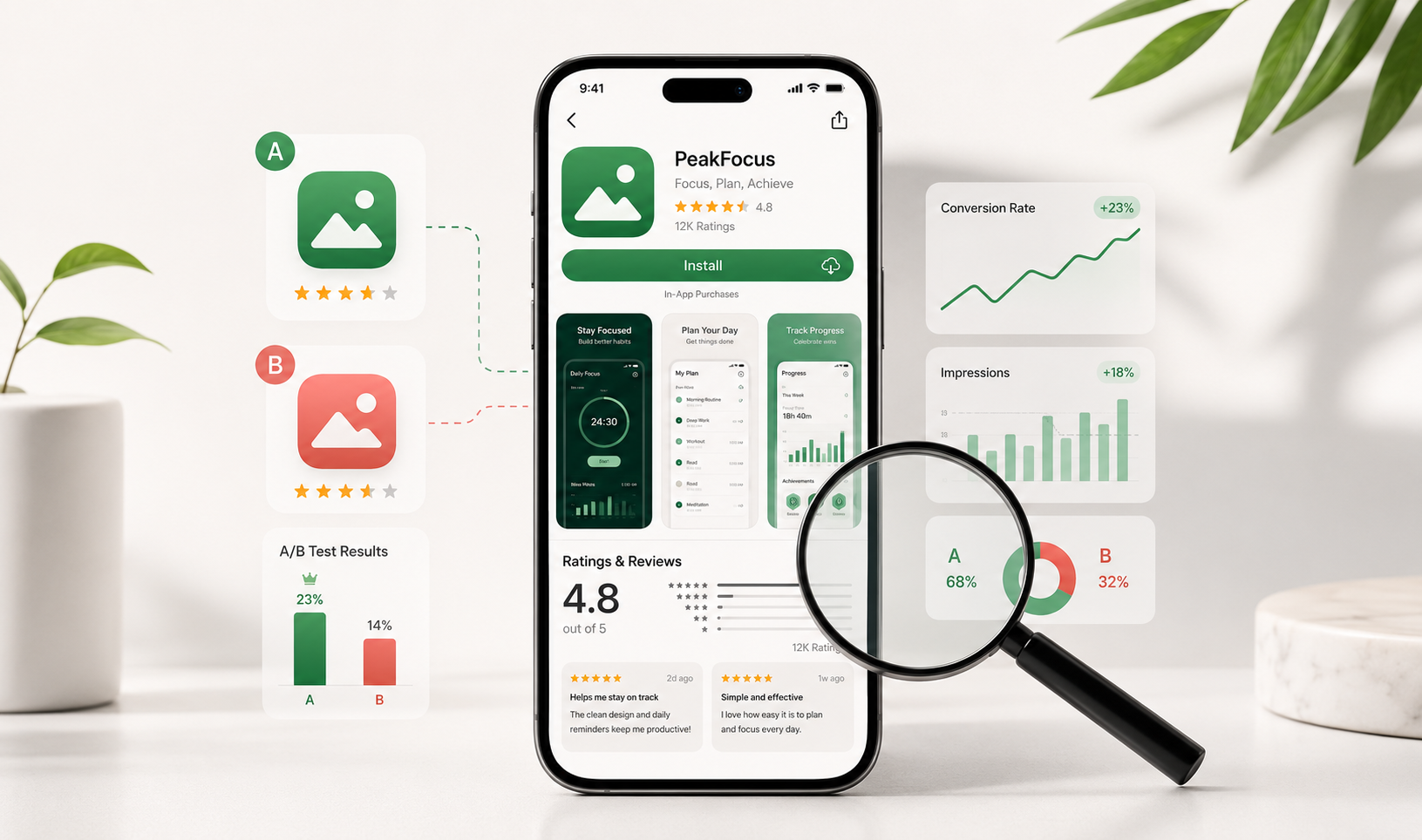
App-pictogrammen moeten zo eenvoudig zijn dat ze direct herkenbaar zijn op 60x60 pixels, wat betekent dat de focus moet liggen op één primair visueel element. De meest succesvolle pictogrammen communiceren het doel van hun app via één enkel, memorabel symbool in plaats van meerdere concurrerende elementen. Minimalistische ontwerpen presteren steevast beter. Een overvloed aan alternatieven bij conversietesten.
Eenvoud betekent niet saai of generiek. Je icoon kan onderscheidend zijn en tegelijkertijd strakke designprincipes behouden. Denk bijvoorbeeld aan hoe grote apps zoals WhatsApp, Spotify en Instagram eenvoudige vormen en kleuren gebruiken om direct herkenbare merken te creëren.
Veelvoorkomende valkuilen bij complexe ontwerpen zijn onder andere te veel tekst, het onnodig gebruiken van meerdere kleuren of het toevoegen van fijne details die bij kleine formaten verdwijnen. Houd er rekening mee dat uw pictogram op verschillende apparaten en in verschillende contexten in verschillende formaten wordt weergegeven, van kleine zoekresultaten tot grotere app store-vermeldingen.
Test de eenvoud van je icoon door het op verschillende apparaten in de app store op ware grootte te bekijken. Als je het belangrijkste element niet direct herkent of als details onduidelijk worden, moet je ontwerp vereenvoudigd worden. Het doel is directe herkenning en gedenkwaardigheid, niet artistieke complexiteit.
Welke kleuren werken het beste voor app store-pictogrammen?
Heldere, verzadigde kleuren presteren doorgaans beter dan gedempte tinten, omdat ze een sterkere visuele impact hebben in app store-omgevingen. Blauw, rood en groen domineren succesvolle app-pictogrammen, terwijl paars en oranje je kunnen helpen op te vallen in categorieën waar deze kleuren minder gebruikelijk zijn. Kleurencombinaties met hoog contrast Zorg voor goede zichtbaarheid bij verschillende achtergronden en lichtomstandigheden.
Kleurenpsychologie beïnvloedt de emoties en verwachtingen van gebruikers. Blauw suggereert betrouwbaarheid en professionaliteit, waardoor het populair is voor productiviteits- en financiële apps. Rood wekt urgentie en opwinding op, wat goed werkt voor games en sociale apps. Groen staat voor groei en gezondheid, geschikt voor fitness- en financiële apps.
Houd bij het kiezen van kleuren rekening met de categorie van je app. Als de meeste concurrenten blauw gebruiken, kan een goed ontworpen rood of oranje icoon meer aandacht trekken. Kies echter geen kleuren die botsen met de verwachtingen van gebruikers voor jouw type app.
Culturele overwegingen zijn belangrijk voor apps die wereldwijd worden gelanceerd. Rood symboliseert geluk in Aziatische markten, maar kan in westerse contexten gevaar suggereren. Onderzoek de betekenis van kleuren in uw doelmarkten om onbedoelde negatieve associaties te voorkomen die het aantal downloads kunnen schaden.
Vermijd het gebruik van te veel kleuren in één pictogram. Twee tot drie kleuren werken meestal het beste, waarbij één dominante kleur het grootste deel van de ruimte inneemt. Achtergronden met kleurverlopen kunnen werken, maar zorg ervoor dat ze het belangrijkste visuele element niet overschaduwen.
Hoe test je of je app-icoon daadwerkelijk gebruikers zal converteren?
Door middel van A/B-testen met verschillende pictogramontwerpen via experimenten in de app store, wordt duidelijk welke versies meer downloads genereren. Zowel de Apple App Store als de Google Play Store bieden ingebouwde testtools waarmee je de prestaties van pictogrammen kunt vergelijken met die van echte gebruikers. Focus op conversieratio-statistieken Bij de beoordeling van de resultaten moet rekening worden gehouden met persoonlijke voorkeuren.
Stel tests in waarbij maximaal twee tot drie pictogramvarianten worden vergeleken. Het gelijktijdig testen van te veel opties maakt het lastiger om te bepalen welke specifieke elementen betere prestaties opleveren. Voer de tests minimaal twee weken uit om rekening te houden met dagelijkse en wekelijkse gebruikspatronen.
Monitor belangrijke statistieken, zoals de verhouding tussen impressies en productpaginaweergaven, en de verhouding tussen productpaginaweergaven en installaties. Deze statistieken laten zien hoe goed uw icoon de aandacht trekt en bezoekers omzet in downloaders. Besteed aandacht aan de prestaties in verschillende gebruikerssegmenten en geografische regio's.
Verzamel kwalitatieve feedback via gebruikersenquêtes of focusgroepen voordat je app-tests uitvoert. Vraag potentiële gebruikers welke pictogrammen hen als eerste opvallen en welke apps ze het meest waarschijnlijk zouden downloaden. Deze voorlopige feedback helpt je om overduidelijk zwakke ontwerpen te elimineren voordat je investeert in formele tests.
Overweeg het testen van seizoensgebonden varianten of iconen die geoptimaliseerd zijn voor specifieke marketingcampagnes. Iconen die goed presteren tijdens feestdagen of speciale evenementen werken mogelijk niet het hele jaar door, dus plan voor continue optimalisatie in plaats van eenmalige tests.
Wat zijn de grootste fouten in app-pictogrammen die het aantal downloads negatief beïnvloeden?
Pictogrammen met veel tekst presteren slecht omdat woorden onleesbaar worden bij kleine formaten en niet goed overkomen op wereldwijde markten. De grootste boosdoener voor conversieverlies is... slechte schaalbaarheid, Waar belangrijke details verdwijnen wanneer pictogrammen tot miniatuurformaat worden verkleind. Generieke stockfoto's verminderen ook het aantal downloads, omdat apps daardoor onprofessioneel of haastig gemaakt lijken.
Inconsistente branding tussen je app-icoon en de screenshots in de app store zorgt voor verwarring bij gebruikers en vermindert het vertrouwen. Je icoon moet de daadwerkelijke app-ervaring en visuele stijl weerspiegelen. Misleidende iconen leiden misschien wel tot meer downloads in eerste instantie, maar tot slechte recensies en een hoger verwijderingspercentage.
Technische problemen zoals pixelering, onjuiste afmetingen of slechte kleurweergave schaden de waargenomen kwaliteit van uw app. Appwinkels tonen pictogrammen in meerdere formaten, dus zorg ervoor dat uw ontwerp perfect werkt in alle vereiste afmetingen. Wazige of vervormde pictogrammen geven potentiële gebruikers direct een signaal van lage kwaliteit.
Als je designtrends te nauwgezet volgt, valt je app eerder op dan dat hij zich onderscheidt. Hoewel het belangrijk is om actueel te blijven, vermindert het kopiëren van populaire iconenstijlen je eigenheid. Streef naar tijdloze designelementen die niet snel verouderd raken.
Als u de prestaties van uw app wilt optimaliseren, verder dan alleen het pictogram, dan is een uitgebreide oplossing wellicht iets voor u. App Store Optimalisatie We pakken alle elementen aan die van invloed zijn op het aantal downloads. We helpen apps hun zichtbaarheid en conversieratio's te verbeteren door strategische optimalisatie van iconen, screenshots, beschrijvingen en zoekwoordtargeting op zowel iOS- als Android-platforms.
Veelgestelde vragen
Hoe vaak moet ik het ontwerp van mijn app-pictogrammen bijwerken?
Update het app-icoon alleen als er gegevens zijn die slechte prestaties aantonen of wanneer er grote wijzigingen in de app worden doorgevoerd. Regelmatige icoonwijzigingen kunnen bestaande gebruikers in verwarring brengen en de merkherkenning schaden. De meeste succesvolle apps behouden hun basisicoonontwerp jarenlang en voeren slechts kleine aanpassingen door op basis van A/B-testresultaten of seizoensgebonden campagnes.
Wat is de beste manier om te beginnen met A/B-testen voor iconen als ik een solo-ontwikkelaar ben?
Begin met de ingebouwde functie voor het testen van pictogrammen in de Google Play Store. Deze is gratis en eenvoudig in te stellen. Maak 2-3 varianten van je huidige pictogram en focus je op één element tegelijk (kleur, vorm of hoofdsymbool). Voer elke test minimaal 14 dagen uit en focus op verbeteringen in de conversieratio in plaats van op het aantal vertoningen.
Moet het pictogram van mijn app exact overeenkomen met het logo van mijn bedrijf?
Je app-icoon moet je merkidentiteit weerspiegelen, maar hoeft geen exacte kopie van je logo te zijn. App-iconen moeten ook op kleine formaten en in de context van app stores goed werken, wat vaak een vereenvoudiging of aanpassing van het bedrijfslogo vereist. Geef prioriteit aan herkenbaarheid en functionaliteit boven perfecte merkconsistentie.
Hoe weet ik of mijn pictogram te veel lijkt op dat van concurrenten?
Zoek in beide appwinkels naar jouw appcategorie en maak screenshots van de eerste 20-30 resultaten. Als jouw icoon opgaat in de rest of er bijna identiek uitziet, moet je je meer onderscheiden. Richt je op unieke kleurencombinaties, opvallende vormen of creatieve interpretaties van gangbare symbolen in plaats van succesvolle concurrenten direct te kopiëren.
Wat moet ik doen als mijn app-icoon goed presteert tijdens tests, maar wordt afgewezen door appwinkels?
Bekijk de specifieke afwijzingsredenen en de richtlijnen van de app store zorgvuldig. Veelvoorkomende problemen zijn onder andere inbreuken op handelsmerken, misleidende afbeeldingen of technische problemen zoals onjuiste bestandsindelingen. Pak de specifieke nalevingsproblemen aan, maar behoud tegelijkertijd de ontwerpelementen die in uw tests goede resultaten opleverden.
Kan ik hetzelfde pictogramontwerp gebruiken voor zowel de iOS- als de Android-appstore?
Ja, het gebruik van consistente pictogramontwerpen op alle platforms draagt bij aan merkherkenning. Zorg er echter wel voor dat u de technische specificaties van elk platform volgt met betrekking tot afmetingen, bestandsindelingen en hoekradiusvereisten. Het visuele ontwerp kan hetzelfde blijven, terwijl de technische implementatie voor elke winkel wordt aangepast.
Hoe maak ik variaties op app-pictogrammen zonder een ontwerpachtergrond?
Gebruik tools zoals Canva, Figma of Adobe Express, die sjablonen voor app-pictogrammen en eenvoudige bewerkingsfuncties bieden. Concentreer je op het aanpassen van één element tegelijk: verander kleuren, pas vormen aan of wijzig het hoofdsymbool. Overweeg om een freelance ontwerper in te huren voor de eerste concepten en maak vervolgens zelf variaties op basis van hun ontwerpen.
Gerelateerde artikelen
- Hoe kun je een app effectief promoten via TikTok?
- Hoe kun je een app promoten om de conversieratio te verbeteren?
- Wat is het beste moment om gebruikers te vragen een app-recensie te schrijven?
- Welke invloed hebben screenshots op conversies in de app store?
- Wat is app store-metadata?
- Welke invloed hebben zoekwoorden op de ranking in app stores?
- Waarom heeft mijn merk-app een app store-optimalisatiestrategie nodig?
- 7 veelgemaakte fouten bij het optimaliseren van de app store
- Wat is het verschil tussen optimalisatie voor de Apple App Store en de Google Play Store?
- Wat zijn aangepaste productpagina's op iOS?